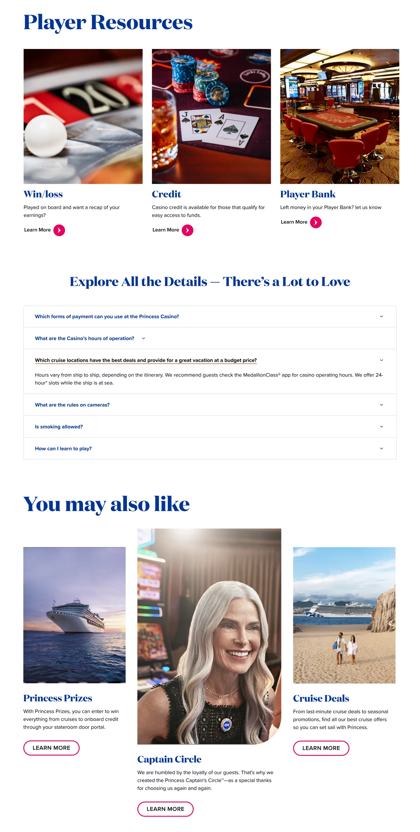
The cruising company observed a significant gap in bookings for casino-enabled cruises compared to their other offerings. Despite having world-class casino facilities on select ships, the existing website failed to highlight these experiences effectively.
The lack of targeted content and compelling visuals led to missed opportunities in attracting casino enthusiasts and converting interest into bookings.
With the rise of experiential travel and niche tourism, casino cruises represent a lucrative segment. However, the original website treated these offerings as secondary, burying them within generic entertainment pages.
The redesign aimed to reposition casino cruises as a premium experience, improve discoverability, and streamline the booking process for this audience.
Before designing, I audited seven cruise lines to map which loyalty and player-support features they surface on their casino landing pages. The gaps — particularly Princess's missing Players Rewards visibility and inconsistent Tier Match coverage industry-wide — directly informed the redesign priorities.
| Offers Hub | Loyalty Tier Match | Casino Credit | Players Rewards | Win/Loss Statement | |
|---|---|---|---|---|---|
| Royal Caribbean | ✓ | ✗ | ✗ | ✓ | ✓ |
| Celebrity Cruises | ✓ | ✗ | ✓ | ✗ | ✓ |
| Norwegian | ✗ | ✓ | ✓ | ✗ | ✗ |
| MSC | ✗ | ✓ | ✗ | ✓ | ✗ |
| Oceania Cruises | ✗ | ✓ | ✗ | ✓ | ✓ |
| Carnival | ✗ | ✗ | ✗ | ✓ | ✗ |
| Holland America | ✗ | ✗ | ✗ | ✗ | ✗ |
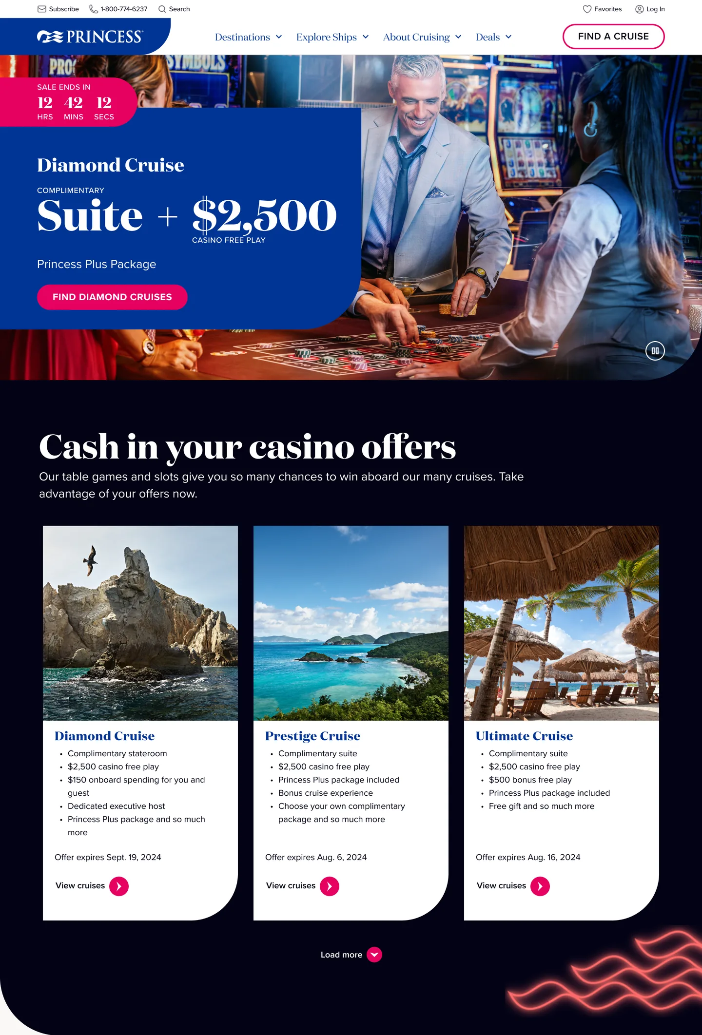
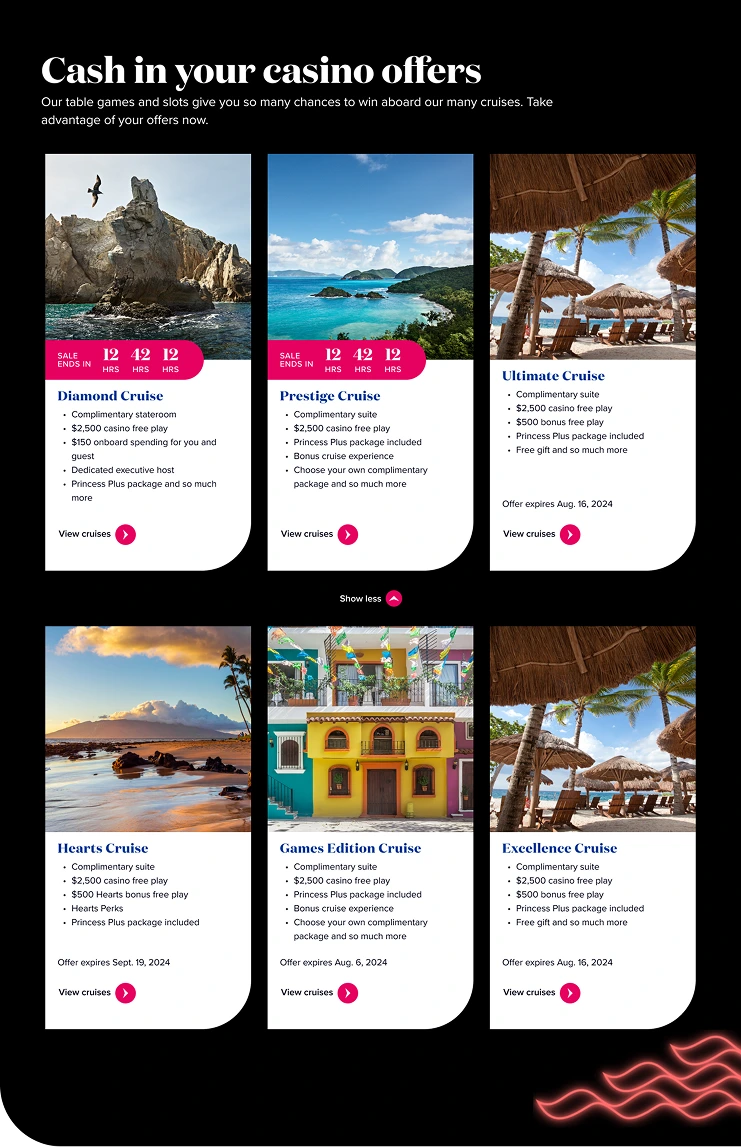
As part of the Casino Landing Page redesign, a new section was introduced near the top of the scroll: a dedicated space where users can view all their available casino offers.
Benefits — these personalized incentives are highly valued by players and serve as a powerful motivator to continue engaging with onboard casino experiences. By surfacing these offers early in the page flow, the redesign not only increased visibility but also reinforced a sense of exclusivity and reward, encouraging repeat play and deeper loyalty.
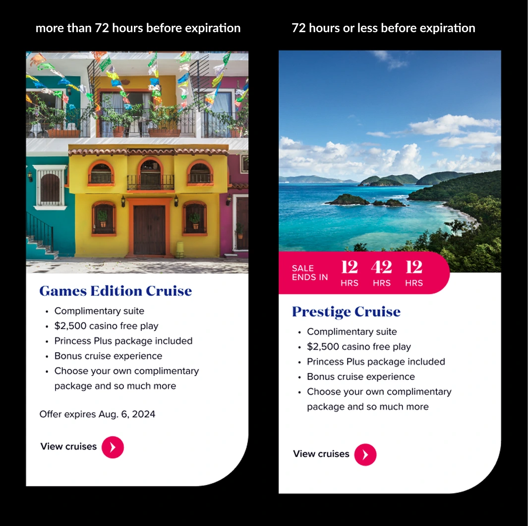
Casino offers include an expiration date. When an offer enters its final 72 hours, the card design automatically switches to a live countdown state. Before this threshold, the expiration appears in body-style text positioned above the tertiary CTA. In countdown mode, the timer moves to the top of the card, overlapping the image on a Passion Pink background and pushing the content downward.
Casino Offer cards are sorted by date, so any card in countdown mode surfaces to the top. These design choices make countdown cards visually distinct, ensuring players don't miss time-sensitive offers and reinforcing urgency to drive bookings.
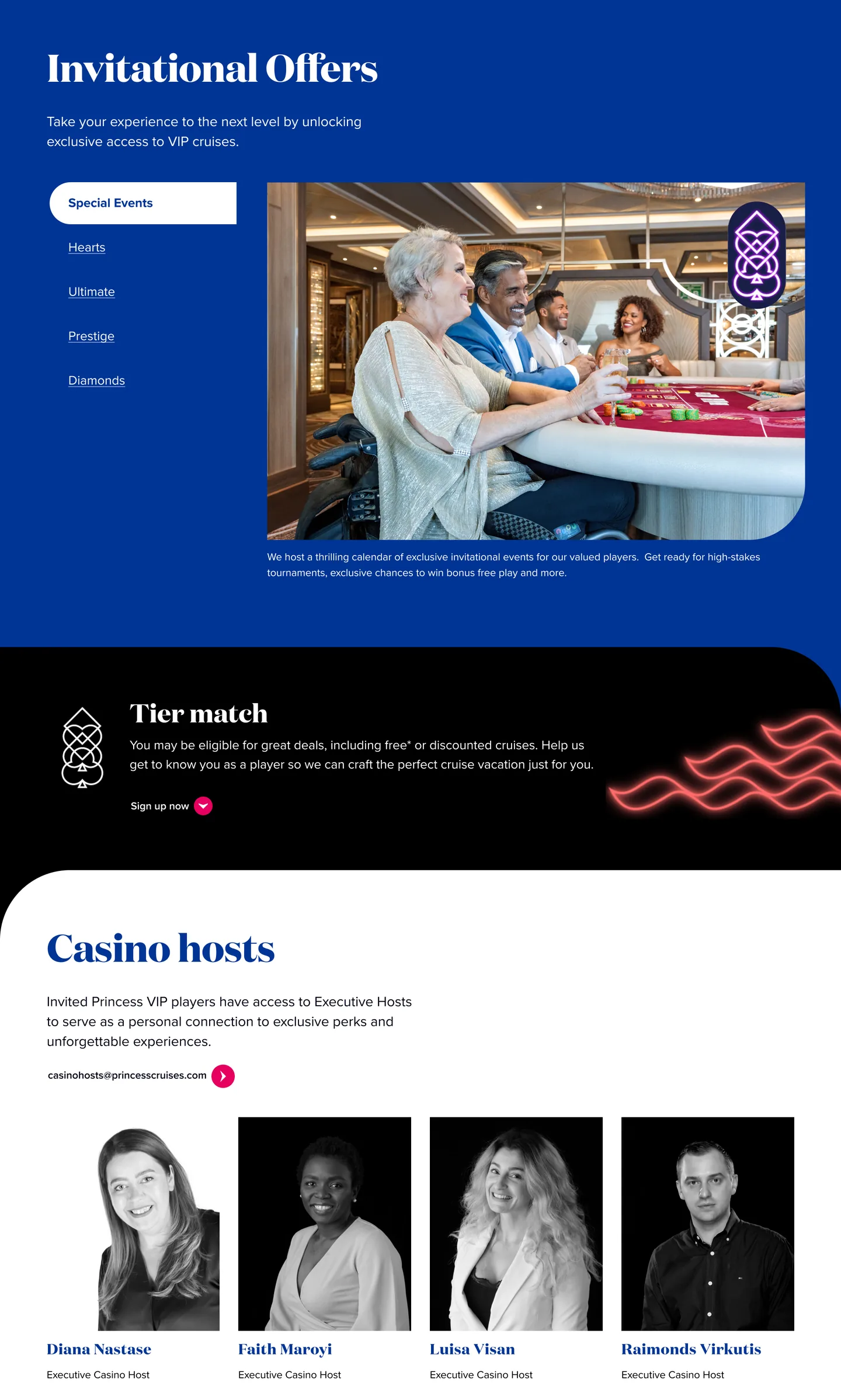
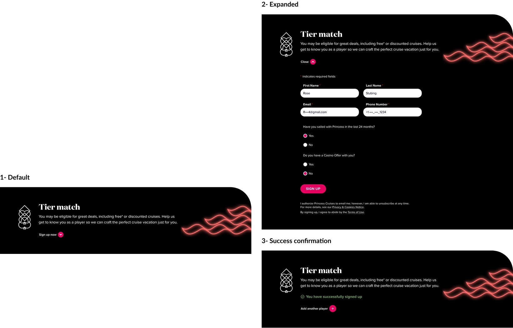
Previously, users had to visit an external site to complete the form. In the new design, we implemented a progressive disclosure pattern by embedding the Tier Match form within an accordion component.
Benefits — streamlines verification by keeping users on the page, boosts form completion, and maintains a clean UI.
Following the implementation of the redesigned casino landing page, the cruise line experienced a 31% year-over-year increase in casino-related bookings. This uplift highlighted the effectiveness of the new design in driving user engagement and conversion.
By streamlining the booking experience and integrating key features like in-page tier match verification, the redesign removed friction points and encouraged more users to complete their casino-related reservations.
Grounding the work in behavioral data and stakeholder interviews was what earned alignment — tying each design choice to a real friction point or business goal made it defensible rather than aesthetic.
The 24-week timeline accommodated proper discovery and leadership review cycles. Compressing this would have meant shipping a prettier page that converted no better than the old one.